

Jen’s son just showed up on the doorstep, home for the summer, with a U-Haul full of dorm room furniture.
She’s told him, many times, that she turned his room into a gym the moment he got his scholarship, but now she has to find room for her gym equipment and her crafting corner while still pretending to be excited that his summer classes fell through.
You, the self storage owner, don’t get to talk to Jen. You don’t get to craft a perfect pitch for her or explain why your facility is different from all the others in the area.
Because Jen isn’t calling you. Jen isn’t calling anyone. She’s Googling “storage near me” on her phone (and hiding her frustration).
She needs a storage unit, fast. Can your website turn her into a customer?
Websites are complex, intricate pieces of software that function as your online storefront. Every business needs a website, because (nearly) every customer is looking for goods and services online before they look anywhere else.
Good self storage websites can track engagement, optimize pricing, take payments, and much, much more. The options can be overwhelming, especially if you specialize in self storage and not web design.
But your end goal is simple. Your website needs to turn prospective customers into tenants, like Shamrock Storage did!
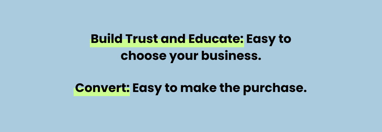
We’ve broken down this process into three steps. Any good self storage website must:
Rentals are the ultimate goal of any self storage website. If you rank #1 on Google and have a beautiful website, but don’t get rentals online, what’s the point?
And it’s impossible to convert renters without first building trust and educating them.
Jen doesn’t know a lot about choosing storage units. She doesn’t care about the brand she stores with. But she isn’t going to rent with a website or facility that feels sketchy.
Your website (and your facility) must be able to build the foundation of trust with people who are considering renting with you.

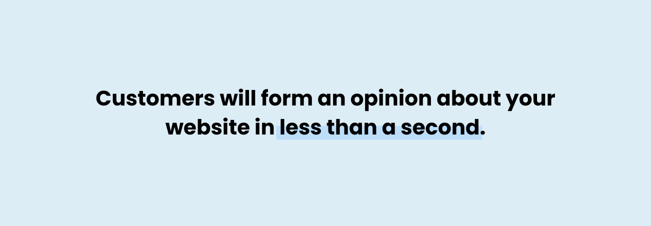
It takes less than a tenth of a second for a customer to start forming an opinion, and that opinion is complete within seven seconds.
If your website doesn’t build trust, it’ll take them less than seven seconds to back out and try someone else. Jen doesn’t know anything about your business (or the industry) - she doesn’t know your brand, and she doesn’t know any other brand.
All else equal, why would she choose to rent at a facility that doesn’t have a nice-looking online storefront?
Whole industries are built around getting people to go to a specific website. Self storage SEO is all about ensuring your website shows up in front of searchers to give them a chance to click on yours!
Web design is what turns that hard-won click into a rental. Check out SurePoint's story to see how they got 10x more online rentals with a better website!
Once a searcher clicks your website, they’re going to form an opinion in less than a second.
Does the website look good? Does it look professional? Does it look modern, or does it look like it was built in the 90s?
If your website looks dated, they’ll assume your facility is dated too. In these first few seconds, your customers only know what you show them. They will be extrapolating everything else know from these images.
Be sure your website has an attractive design, with an uncluttered aesthetic that helps customers find what they’re looking for. The colors should be well balanced, and the pictures prominent but unobtrusive.

Just like in your office, everything needs to be carefully organized, neat, and functional. If someone walks into your office and isn’t sure where to go to rent a unit, that’s a problem.
The same is true for your website. If a customer wants to rent a unit, make it easy for them. If they have a question, make it easy to find the answer.
The biggest question a visitor to your website has is this: “Should I rent from this business?”
One of the best ways to answer this question (positively) is by posting lots of high-quality photos of your business.
A picture’s worth a thousand words, right?
For some things, a good picture is worth far more than that. You can describe your amenities online all you want, but a photograph can show your customer proof of those amenities.
Anyone can claim that they take good care of their facility - photographs of a clean, well-kept lot are much more convincing.
If you were shopping for a new product on Amazon, and the first option you found didn’t have any pictures, would you buy it? Or would you look for a different option?
Low-quality photos, few photos, or stock photos can all make a product look like it’s hiding something.
The same goes for Jen when she's looking for a storage facility. If there are no good pictures on your website, she might assume that’s because your facility doesn’t look good. Maybe it’s dirty, maybe it’s overgrown with weeds, maybe the fence is falling down - whatever the reason, it won’t be good.
Use your self storage photography to convince that potential customer that your business is the best option! Clean the facility, choose a bright sunny day, and take photographs of all the amenities that you advertise elsewhere.
If your manager (or you!) is comfortable with it, use some photos of the folks your customers will find on-site. A smiling, friendly face can communicate more than using “Exceptional Service!” in your header.
Some operators hire a professional photographer to shoot their facility - this is great if it’s within your budget, but if it’s not, you can make do with your smartphone or other digital camera.
Make sure the facility is clean and in good shape. If you’re thinking about painting the doors or fixing the fence, do that first (and don’t wait too long).
Pick a clear sunny day, and take as many photos of your facility as you can. Make sure you get good photos of every major feature of your facility, including:
Anything you’re advertising on your website needs a photo. If you’re proud enough of your amenity that you think it’s worth telling customers, it’s definitely worth showing them!
And even better than that?
Some of the best websites we’ve built feature overhead drone videos of the facility.
Check out Rocky Hill Storage! Anyone who lands on this website is going to see exactly what sort of facility they’re considering, alongside an impressive set of drone videos that prove they go above and beyond.
Drone videographers may not be in everyone’s budget, and that’s ok - videos of any sort are a good way to show that you’re committed to your business.
Do a walkthrough video of your office and your facility. Show customers what it looks like to drive through your gate and to one of your storage units.

Video can answer a lot of questions that your customers may not even know to ask!
Maybe the potential customer is worried about driving the giant moving truck for the first time - a video can show that your aisles are nice and wide and easy to drive through.
Even if your lanes aren’t wider than the competition, a video can showcase yours. If the competition doesn’t have a good video (or set of photos), the new driver doesn’t know how driving there will be. They’re certain that yours is easy.
Who are they going to choose?
The same goes for security, convenience, and size questions - videography and photography can prove to customers that your facility has what you say it does.
More than that, photos and videos build trust. They tell your customers that the owner cares about this business, and by extension, the owner is going to care about them.
Photos and videos are good proof of some things - your facility has what you say it has.
But customers are accustomed to photos that don’t quite tell the truth, too. We’ve all seen photos of a great vacation spot that turned out to be underwhelming or a burrito that looks fantastic on TV and turns out to be flat and gross in reality.
Sure, the photos look nice, Jen might be thinking, but how old are they? Does it still look like that?
Reviews address these concerns.
Your website should showcase your positive reviews to customers who need to see them.
Check out our guide on getting reviews for your storage facility here!
Reviews are a huge influence on online purchases, especially Google reviews. These are governed by a neutral party - and Google has done a good job of instilling confidence in their system.
Google reviews aren’t 100% unbiased, but they’re a good deal better than reviews that are hosted by the party being reviewed.
Your Google reviews are a powerful ranking factor. Google wants to give the best response to searchers, and reviews are one of the few ways Google can tell who does a good job and who doesn’t.
99.9% of customers read reviews when they shop online. Much like with photos, if you’re not showing reviews it can come across like you’re hiding something.
Highlighting your reviews - mostly good, but also the bad - builds trust. You’re not hiding anything from your customers.
That starts you off on the right foot.
After that split-second first impression, a few seconds checking out the cool drone video you added, and a nod at your 4.7-star review rating, we come to educating customers.
(I know, we’re only a few seconds into the person clicking on your site! Wild.)
Pictures, videos, and reviews go a long way toward educating your customers, but can’t answer every question.
Don’t forget that your website is built for people who are shopping for storage online. Those people who don’t want to do business online can still rent from you, but they’ll be calling or visiting instead.
Answer the questions that online shoppers might have.
The first big question any potential customer is going to ask is should I rent here?
So the information you provide should follow the same line as your photography and videos - showing them why you’re the best choice.
Often, self storage websites showcase the best amenities a facility can offer alongside the best deals. These are important, but they’re not the whole story.
Jen doesn’t want a storage unit - she wants to clear out her home gym so her son can move back into the room. The storage unit is a step on the way to that goal.
While you are justifiably proud of your storage facility and its amenities, your customers aren’t interested in the specifics.
They want to know how your facility can solve their problems. Will their truck fit through the aisles? How big a unit do they need to store all this stuff? Will they have to buy their own lock, or can they get one at the facility?
Your website must answer these questions.
Will I be safe storing here?
Your customers may be worried about an old storage facility they rented from before that was dirty, run-down, and decidedly unsafe. According to the 2023 SSA Demand Study, about half of people who rent storage are women - if your facility looks sketchy, they may not be comfortable coming by at night.
Pictures of a facility that looks safe and welcoming (especially at night) can answer this question before the visitor even thinks of it!
What type of storage do I need?
We know a lot about storage, but the typical storage unit renter does not. They’re trusting you to point them toward the right unit.
Your website needs to have tools that can help a rookie storage renter determine what unit they need. That can mean a size calculator, amenities explanations, and a breakdown of why certain types of storage are better for specific items.
Unless an issue is very complicated (scheduling the use of a free moving truck, for example), try to avoid asking the customer to call. Some customers don’t mind and will call if they have questions - others will simply click out of your website and try a different facility.
Younger generations especially avoid phone calls where they can.
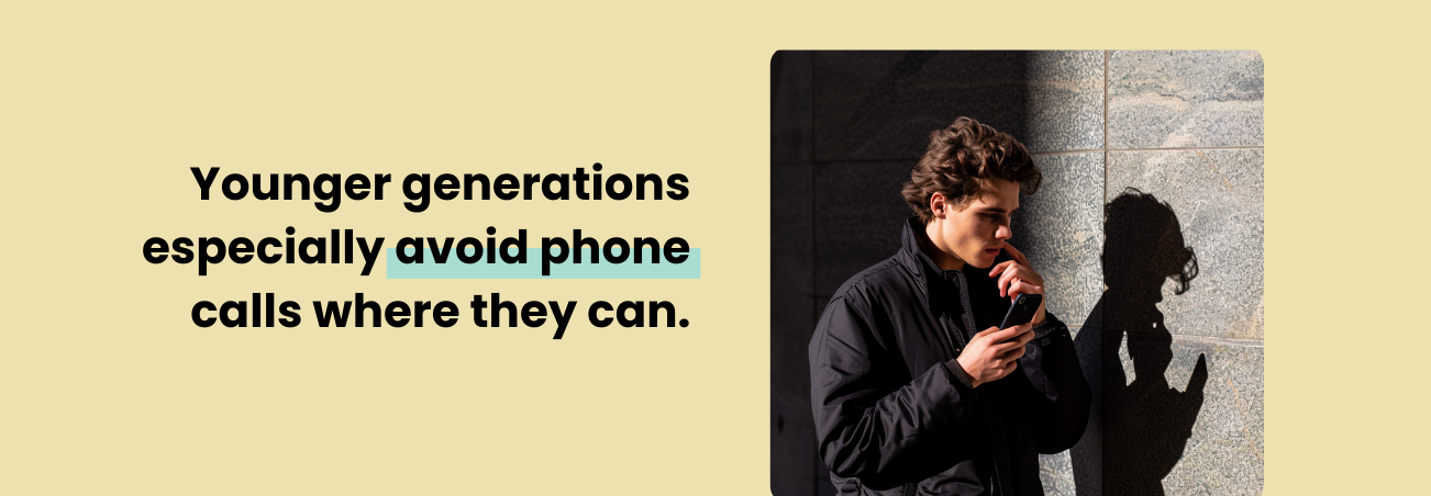
The more information you can convey online - without making your homepage a cluttered mess - the better. Keep potential renters on the page!
Of course, you want to ensure your contact information is available to everyone who visits your site, even if you hope they can find everything they need online.
Your address is the most important piece of contact information because this shows your customers how far they’re going to have to travel. Then your phone number, so that renters who want to speak with a person can do so.
Email and other contact methods are great, too - let your customer choose how they interact with your business. If they use email, that’s probably the best way to respond. The same goes for texting and calls.
Typically, websites display contact information in a header at the top, in a footer at the bottom, and in a banner in a prominent place. Expect customers to look there for your contact information.
Your website is a vital part of running a self storage business. Without a website, you might as well not have a sign - you’d miss about the same number of tenants.
But, if all your website does is provide information, it may as well be a sign.
Self storage websites need to turn visitors into renters. It needs to:
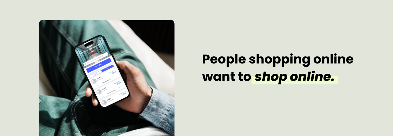
Remember, people search for storage units online because they want to rent a storage unit online. Spacebox Storage gets about 50% of their total customers from online rentals!
Modern shoppers are accustomed to ordering everything from household goods to food to cars, all entirely online. If they can’t rent a storage unit online, they’re likely to go elsewhere.
Not only are online rentals what a lot of our customers want, but they’re the best for operators, too. Online rentals can happen any time, day or night, without input from your managers or yourself.
You can still require whatever security measures you prefer, like ID upload, if you’ve got the right software. Perhaps you want to see the person before you let them sign a lease - that can work (though it’s not ideal). The most important thing is that you complete the transaction, rent the unit, and sort the rest out in the morning.
The best way to get customers to rent online is to make it easy! The fewer clicks it takes, the better.
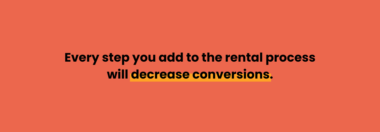
Every step you add to the rental process is going to decrease your conversion rate.
For some operators, the sacrifice is worthwhile to ensure everyone purchases a tenant protection plan or uploads their ID. Others want to maximize conversion - a good self storage website can be customized to meet your goals.
Online rentals are 24/7, and up to 30% of our clients' rentals occur outside of office hours. If you don’t offer online rentals, those leads aren’t going to wait - they’ll rent somewhere else.
A website with flexible value-based pricing helps you meet your customers exactly where they are.
Maybe your customer plans on visiting their unit often - a unit near the gate would save them significant time compared to winding through the back of your facility.
Maybe your customer is storing all the furniture from their living room - they probably don’t want a second-story unit for that.
Maybe your customer is really concerned with security - they’d be willing to pay a little extra for a unit with an individual alarm.
Value pricing lets you set up variable pricing options for each of the different aspects of your facility.
This a great way to bring in a little extra revenue, but it also helps create a more accurate price-per-value for your storage units. Customers on a budget can choose to take the low-priority storage units near the back of the facility and save some money.
Those who have the means and desire can pay more to get the unit they really want.
Why should I use value pricing?
To make more money and get tenants in units they’re happier with. Value pricing increases revenue by catering to your customers' preferences.
The last thing your website needs is online bill pay functionality.
Automatic payments are great for operators. Automatic payments can greatly decrease the number of payments that get missed - that alone is reason to use it.
But online bill pay options aren’t just good for the business owner. The customer doesn’t want to write out a check and mail it to your facility in an envelope. Jen certainly doesn’t want to drive down to your office and hand it over in person.
Online bill pay is fast and easy, and if you have the right software, it’s secure.
Like with online rentals, your customers are surrounded by conveniences like this. If you’re the only business they run into that doesn’t let them pay from their computer after they get home from work, you might run into trouble.
The biggest reason you need to upgrade to online bill pay is that the REITs all offer it.
Why do I need to offer online bill pay?
Online payments are standard now, and if you don’t offer them, you’ll stand out in a bad way.
Modern companies, from Amazon to the coffee shop down the street, are competing to provide the most convenient experience.
How many folks do you know that use DoorDash? Uber? InstaCart? How many shop mostly online?
Twenty years ago, companies competed on price, amenities, service, branding – and those all still matter! But today, convenience is as important as any of those to your customers.
Self storage web design is all about making the shopping experience easy. Make it easy for customers to choose your facility, then make it easy for them to rent from your facility.
Web design is intricate, technically challenging, and aesthetically demanding. Competitive self storage businesses need a website designed by professionals and not just the cheapest and easiest options.
If you want your business to excel, you need an excellent website.
Check out how Elmwood Self Storage & Wine Cellar manages to showcase all 11 of their different services in one convenient site!
You need a website that takes care of your customers. You need a website that:
The ultimate goal of any self storage website should be to get your facility more rentals.
A good website will help keep your existing customers happy because you’ll be able to offer the amenities that they’re accustomed to elsewhere.
The specifics of self storage web design are incredibly complicated and difficult - but the ideas behind them are not.
Take care of your customer.
If your website can show your customers what they want to know, give them a reason to trust you, and make it easy for them to rent, you will get more rentals.
To read more about my favorite StoragePug features, take a look at
At StoragePug, we make it easy for new customers to find you and easy for them to rent from you, with made-for-self-storage websites.


